Color Pairing Secrets for Polished Outfits
Master color theory made simple: learn foolproof pairings, capsule-friendly palettes, and pro tricks to balance brights, neutrals, and prints with ease.
Balanced Neutrals: Start with neutrals to build polished outfits that feel intentional rather than improvised. Think beyond black and white; navy, charcoal, camel, taupe, and ivory form a versatile backbone that welcomes color accents without visual noise. The key is temperature and value. Warm neutrals like camel and cream complement earthy hues, while cool neutrals such as charcoal and slate flatter blues and jewel tones. Anchor your look with a dominant neutral, add a supporting neutral for depth, and finish with a color accent. Try charcoal trousers, an ivory knit, and a camel coat for quiet sophistication, or pair navy suiting with dove gray and a soft blush shirt for subtle lift. Mix lightness and darkness within the neutral family to create structure that flatters silhouettes and highlights tailoring. When in doubt, keep accessories neutral—leather in espresso, stone, or midnight—so your outfit reads refined. Mastering this neutral framework makes every color decision easier, ensuring balance, clarity, and a reliably polished finish.

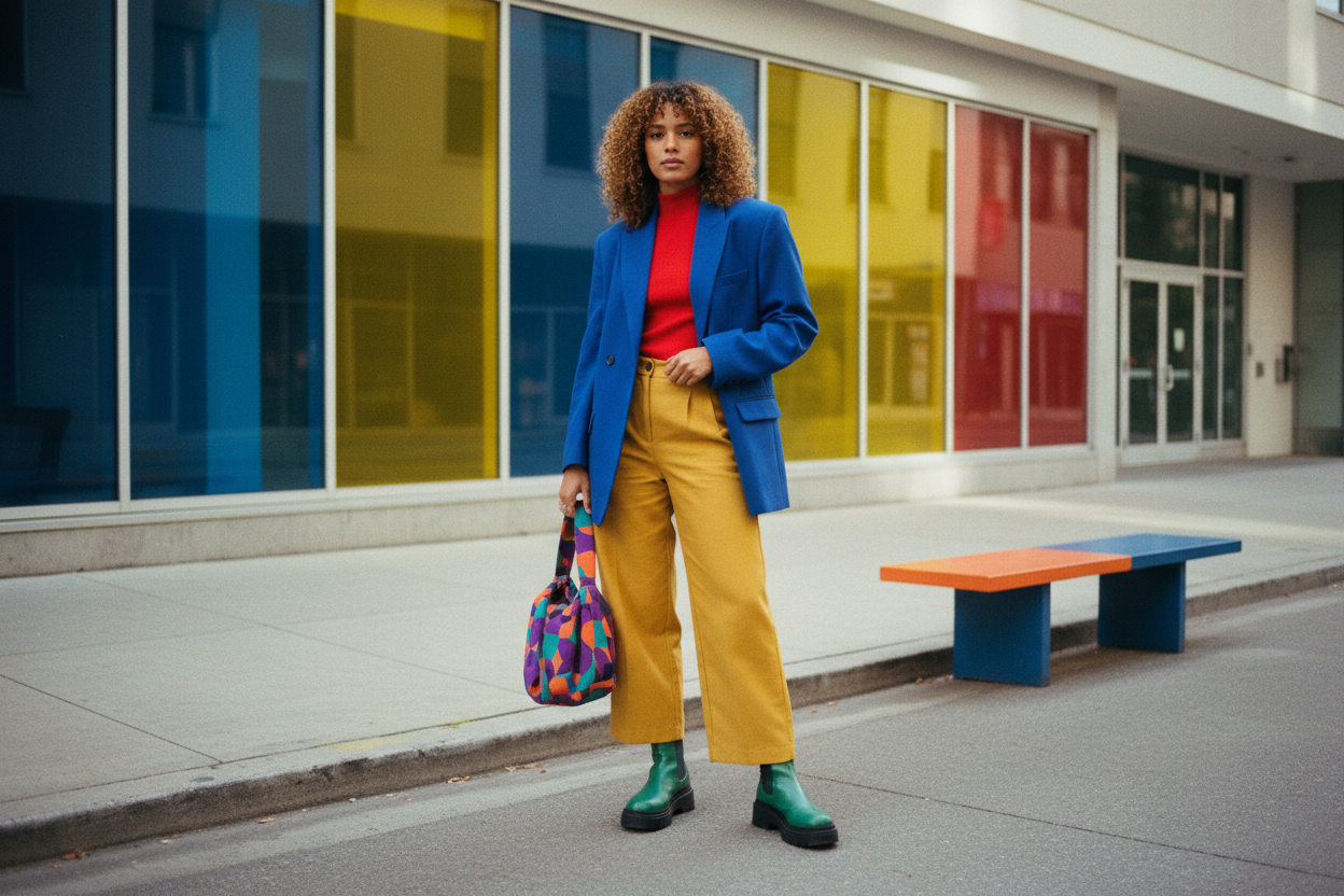
Color Wheel Basics: Understanding the color wheel unlocks combinations that look deliberate, not lucky. Complementary pairings—colors opposite each other—create crisp energy: think teal with rust, cobalt with muted orange, or burgundy with forest green, tempered by a neutral to keep the look wearable. Analogous schemes—neighbors on the wheel—feel harmonious and soothing, like olive, moss, and sage layered with cream. Triadic mixes use three evenly spaced hues for refined vibrancy; dial down saturation to keep outfits elevated, trading primary brights for sophisticated versions such as mustard, deep teal, and merlot grounded by navy. Monochrome dressing, built from a single color family in varied values and textures, reads modern and sleek. Adjust intensity to your setting: softer colors for daytime ease, sharper contrasts for impact. Use a neutral buffer—charcoal, beige, or off‑white—to prevent color fatigue and let key pieces breathe. With these principles, even bold choices look cohesive, confident, and distinctly polished.
Undertones That Harmonize: Great color pairing goes deeper than hue—it depends on undertones. Warm colors carry golden or red bases; cool colors lean blue or slate. Aligning undertones across garments and accessories creates instant cohesion. A warm camel coat loves terracotta, marigold, and cream, while a cool charcoal blazer thrives alongside sapphire, icy blue, and silver. Whites matter, too: pure white suits cool palettes; ecru or pearl flatters warm mixes. Denim reveals undertones as well—inky indigo reads cool; vintage blue can skew warm—so choose jeans that echo your palette. Leather and metals reinforce direction: chestnut and brushed gold amplify warmth; black leather and polished silver fortify coolness. When mixing temperatures, use neutrals as translators—taupe, greige, or soft gray smooth transitions between warm and cool notes. Test by placing fabrics side by side in natural light; if one looks dull, the undertones are clashing. Curating undertone harmony elevates even casual outfits, making color feel intentional, flattering, and quietly luxurious.
Contrast and Proportion: Polished color pairing relies on contrast and proportion as much as the shades themselves. A simple allocation like 60 percent base, 30 percent support, and 10 percent accent gives structure without stifling creativity. Aim for contrast in value (light versus dark) or temperature (warm versus cool), but rarely both at full intensity unless you want maximum drama. For a balanced office look, try a majority of charcoal, a substantial dose of mid‑blue, and a precise pop of saffron in a scarf or pocket square. In softer settings, minimize contrast with tone‑on‑tone layers, then add definition through a sleek belt or shoe in a slightly deeper value. Scale matters: small accents in saturated colors feel chic; large blocks of high‑chroma color can overwhelm. Let patterns act as bridges—pinstripes, micro‑checks, or subtle florals that echo your palette distribute color thoughtfully. When proportions are right, even unexpected hues click into place, delivering clean lines and confident presence.
Texture, Finish, and Fabric: Color never appears in isolation; texture and finish transform how we perceive it. Matte wools mute saturation, while satin and silk amplify luminosity. Leather adds depth; linen introduces airy softness; suede diffuses light for a velvety effect. A monochrome olive look becomes dimensional when you mix a silky blouse, a wool coat, and suede boots—same hue, richer story. Pair crisp cotton shirting with a glossy belt to sharpen a soft knit set, or temper a bold jewel tone jacket with a heathered tee so the color feels wearable. Hardware finishes matter, too: brushed metals read subtler than mirror shine and can calm a vibrant palette. Even denim wash shifts the vibe—clean dark indigo elevates, while sun‑washed blue relaxes. Use texture to fine‑tune mood: introduce sheen for evening polish, matte for daytime ease, and a single glossy note as an accent. When finish supports color, your outfit gains sophistication without shouting.
Practical Pairing Moves: Translate theory into habit with a simple capsule approach. Choose two or three base neutrals (say, navy, charcoal, and ivory) and three to five accent hues that complement your undertone story. Build outfits by pulling one base, one support, and a precise accent; repeat across silhouettes for effortless variety. Keep a swatch set—fabric scraps or photos—to test pairings in daylight before committing. Create default formulas, like navy tailoring plus stone knit plus emerald accent, or taupe column topped with chocolate leather and rose blush. To shift settings, swap accents: cobalt for crisp impact, rust for warmth, soft lilac for ease. When mixing patterns, ensure they share at least one color and vary their scale for clarity. If a combo feels off, adjust either saturation (choose a dustier tone) or value (lighten or deepen one piece). With a curated palette and repeatable moves, your color choices stay consistent, expressive, and effortlessly polished.